Saturday 28 March 2009

Photoshoot: Went Without a Glitch :P

Yesterday (Friday), I did my photoshoot :) Yay

We used the Photography studio and the infinitive curve thingy :)

We had lots of fun... I think Tom has discovered a new talent; he took some really good shots :)

I will upload the best ones soon, after I have had a bit of a tweak :)

Ooooh well excited for the end results!

Here's my fave pic of me...


It's not really anything to do with the shoot, but a nice random one taken by Tom :)

Update 13/04/09 - I have finally got around to uploading the pics!

--->

^^ The guitar transformation!


^^ Bobbins the Geek


^^ Sophie the pretty fitty


^^ Me: the girl with the killer guitar


^^ Doing our thing with the guy


^^ Awwww aren't they cute :)


A bit of messing about :)

Final set of glitch packaging etc


I managed to get everything ready to hand in before half term... it did involve staying up til 3, but was worth it :)

I got a Distinction btw :) Wooop

Saturday 21 March 2009

Typeface by Tasha

The last project in the Typography unit is to design/make our own typeface!

I think this is a great project, and really creative - perfect for meeee :)
The only problem is that, well everything seems to have already been done!

After some random brainstorming, I narrowed it down to the ones I liked the best, including:

Ice cube typeface, Ice lolly typeface, Orange segment typeface, Lipstick typeface (which I have wanted to do for a while now - no copying - I WILL get around to doing it some day haha), Dirty t-shirt typeface, Broken tiles typeface, Cassette typeface

..... anddddd I have chosen to do the Ice Lolly typeface for this project! :)


Me and Mr S. are going to go to the 3D Design studio on Wednesday and do some extrusion to make molds for type :)

I'm gonna steal some wooden stirrer thingys from Maccy D's tomorrow (I'm going to pick up the perfume bottle that I won on ebay - and be chauffeur for my dad) and use them as the lolly sticks - the real things might be too big as letters will only be 9x9cm

I don't think I'm going to do the whole alphabet - I will do the letters which have the main components (straight line, diagonal, curve etc) and I think Tahoma bold in upper case letters is looking nice for this!

The lollies will be made from wax (yes, more wax model making) and will have a nice glossy, coloured but translucent effect and I can spray some water on with one of those mist things to make it look like actual ice! :) Excited much!

I hope this turns out as great as I am envisioning it in my head!!!

UPDATE 13/04/09 - I have been neglecting my blog recently, but I have been busy!

I started making the ice lolly typeface :)


Cutting out the template


Extruding with clay


Using the cheese cutter string thing to get different thickness Rs


Making a wall for the plaster mold


After it had set, I filled the plaster mold with hot melted wax :)


And voila! A wax R... awww and it floats too, how cute :)


Now I'm trying it in different colours...


.... and different material molds. This is gelflex stuff - rubbery and flexy so I can pop the letters out easier and also I can re-heat and re-use it for all the letters :)


Making more molds... I have chosen to do letters R, V, M, C, S and F!


Extruding M :)


MVC :)

Modern Manuscript

Modern and Manuscript - not usually 2 words used together to describe one piece...

My mini dictionary defines these to have meanings of:

Modern adj. of present or recent times
Manuscript n. book or document, orig, one written by hand; copy for printing

When you think of manuscript, you think of old, important writing, one of a kind.... and most probably, Bible? Am I right?

Well this project is going against that (well, no, it will be one of a kind!).

Mr Skinner has given us some really un-interesting (depending on your view) bits of writing by some self-absorbed musicians - the writing content isn't important, it's how it looks that matters (unfortuantly the way it is in society A LOT of the time nowadays hah)

My initial ideas included:
  • This is your life/photo album/ diary style digital book
  • Post it note trail
  • Writing on paintbrush handles
  • Using a game of scrabble to spell out the words
  • Printed onto the back of receipt paper
  • Escalator stairs

After a discussion with Mr S., I have decided that I will try out the Escalator idea and adapted the paintbrush idea so that it is pencil crayons - you can get big sets of all the colours of the rainbow!

Hopefully T.K.Maxx in Lynn will let me take some detailed pictures of their escalator so that I can photoshop the words onto the steps and make it go round and round and round :)

Quite excited by this project... the only problem is that at this moment I have got 3 projects on that I really like - how can i divide my time fairly?

UPDATE - 22.04.09

A bit of a major jump in time on this project... as today was the deadline and everything has been submitted!

I can't upload the finished article YET because its saved as a psd or pdf and my Photoshop trial ran out today so I can't change the file type just yet....

I went with the pencil crayon idea as THE idea after deciding that taking on 2 projects would just create un-needed pressure/stress.

I have analysed the text style/layout and typefaces on pencils like no one ever before (well, someone probably has been geekier, but it feels like I am the biggest pencil typeface geek atm!) in order to replicate some existing styles of pencils and make them look convincing...


...2 of my fave styles *cringe* - I can't believe I have preference on the style of pencils haha
This is one of the crazy things that Graphic design drives you to...

I arranged 49 pencil crayons into different orders... size, colour, random etc and photographed them to get a visually interesting image and I chose to use this one:


The picture isn't the best quality ever but has 'stretched' to A3 without any problems!

And voila.... the final:

UPDATE 26.04.09 - PDF conversion to PNG :)

I like it :)

Thursday 19 March 2009

Book Making


Today Mr Skinner held a book making session!


Above, the specimen!

We made some diddly little books (only 3 signatures)....


Three paper signatures... sitting in a row


The concertina fold spine


Above and Below; Sewing time!


The book army! :) Mine is the amazingly good one (joke!) on the back row, 2nd from left!


... I am now about to cover it in polka dot paper :)


I like it, what do you think? - Hold that thought.... I've just added a well cute bow :)


I might cut the bow a bit shorter though, opinions?

Tuesday 10 March 2009

Poster Nerds 'R' Us :)

After Hilary's lesson today, it would seem everyone is even more desperate for a Distinction on the Improbable product Branding/packaging project!

After lesson Kirsty, Danielle, Stacey, Kelly and I headed into town... for shopping and a bit of photo taking at first but it turned into packaging, posters and bags collection!

I had wanted to take pictures of some of the products in Boots, but even with a letter from Hilary to verify that I was actually a student and not a spy(haha), they said I would need to call customer services and get it o.k.ed by someone in head office and then check back with the Kings Lynn manager........... a bit of a palava if you ask me, so I can't be bothered really!

But Superdrug, Debenhams, Thorntons and Topshop were a lot more helpful :)

Here is just some of the goodies we picked up....


We got loads of posters from Topshop

Some bags and posters from Debenhams

Some Hugo Boss boxes and testers from Superdrug

Some chocolate boxes/packaging from Thorntons


The lady in Debenhams said she had loads of Armani stuff but she had just put them in the crusher!!!!!!!! :( But she took my name and number and said that when she gets some more stuff in she will give me a ring :)

Topshop were really enthusiatic about us taking posters off their hands, and said we are welcome to check back for more :) - Fit Topshop boys on our walls, I like :P hah

We got an impressive haul of stuff if you ask me :)

Sunday 8 March 2009

I <3 Books

I love books.... Twilight, Harry Potter, Gossip Girl, Diary of a crush.... all the typical teenage girly books. But I like to read about other things too...

I confess, I go to the library quite a bit... Wisbech, Gaywood, College - I have membership to all 3 :). I am pretty sure one of the College librarians knows my name Haha. I go to the college library like once a week at least... and I think I have pretty much always had a book out so far.... I'm starting to worry myself.

Recently I've been making my way through the typography books in the Graphics section because we're doing a lot of research on the development and anatomy of type. There is one book that I had to renew like 3 times because I found it really helpful, so I decided that I should probably give others the chance to read it, and I have bought it!


^^^ I got it for £12.20 from WHSmiths online... a saving of £5.75 :) - BARGAIN!

Its got loads of useful stuff about type in and some interesting examples of how type has/can be used.

Its one of a series by GavinAmbrose and Paul Harris, the other titles being Format, Layout, Image, Colour and Print & Finish. I think I've had all of these out of the library apart from Format and Colour :)

I've also got Graphic Design School by David Dabner - this kept me sane while I was missing college back in the week I spent in Portugal at new year, and How to be a Graphic Design, without losing your soul by Adrian Shaughnessy - which I am yet to read. I pestered my mum for these books 2 christmases ago... and only reading 1 out of 2 in like a year and a half is a poor show lol

And last december, while christmas shopping (not intentially for myself) I found an interesting book on the history of Magazine covers... which I bought and then made my sister pay me for it so I could have it for christmas :)

This doesn't count as a book really... but my ex bought me a year subscription to Eye magazine - the international review of Graphic Design (fingers crossed he hasn't cancelled it) for christmas, and it has some interesting articles in... I think I read that the March issue has a lot about Typography in so I look forward to seeing if it arrives... unless the subscription has actually been cancelled :(

Saturday 7 March 2009

Swiss Jazz Posters

As part of Design Studies we are doing research and projects based on Typography.... including hand renderings of type - eek!

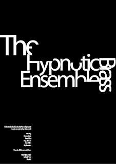
We've been working on these Illustrator drawn Jazz posters... which are kinda turning out a bit like work by Swiss designers such as Josef Muller-Brockmann, Emil Ruder and Armin Hoffmann, if we're lucky that is.

Chris has given us kind of a spec. table... with the typeface, alignment, size, weight, style, colour scheme and shapes stated for use. I don't like goudy old style... on screen :)

I have kind of gone off the point though and now started doing my own kind of versions... no real restrictions, just a bit of what I fancy lol

The only thing is that I can only upload jpeg or bmp pictures to my blog so they go a bit fuzzy... but they look nice in eps,tiff and png, I promise :)

Comments, as always, are welcome :)

Here are some of the ones I have done with the spec table:


I don't like Goudy Old Style on screen ^ (above)


I don't really like this one ^ (above)


Then I moved onto my own...


^ This one isn't quite finished yet....

I decided to do some basically copying the Swiss styles:


Armin Hofmann (Above)


Josef Muller-Brockmann (Above)


Josef Muller-Brockmann (Above)


This one is a mix of the Armin Hofmann poster with another one that I was developing.